Wednesday, 21 April 2010
Magazine production

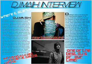
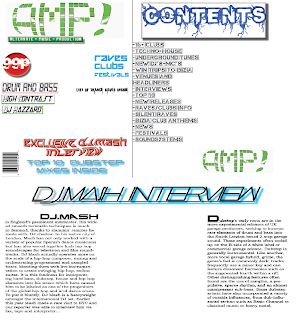
These are print screen images of the beginning stages of InDesign when I was making my magazine, some of the features have been changed such as the amount of words and plugs on the front cover as well as photos. My skills in InDesign have increased by being able to add backrounds and stylise my typography to appeal to the target audience, by using effects in Photoshop as well to get the desired effect. Photoshop was very useful as this was the software I used to create my masthead and other headings, this helped be evolve ideas to make them more suitable for the magazine.
Photography

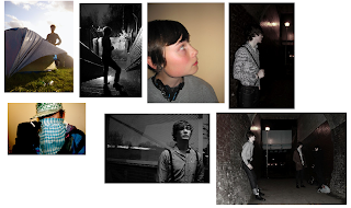
These are some pictures I had taken and chose to use in my magazine, I did not use all the images as they made the page look to clustered and full. I found the that not all the images were as fitting to the magazine so I also used a variation of effects and different range of shots, which helped in making the magazine more profesional.
Mood Board
Tuesday, 30 March 2010
Photo Shoot Set-Up
Monday, 29 March 2010
Audience Research Questionaire

I got people to fill in this questionaire so i could find out how to design my magazine, this helped adjest my initial designs to the magazine. It helped me come to a decision over the mastheads, furthermore I found out that what other oppinions were so I could adjust the who the magazine is aimed for.
Preliminary Brief Outline
My objective is to design a college magazine that appeals to the students of the college, this target audience will be aged 17-19 , as the majority of readers would be candidates of the college. The magazine is informing students of the activities and events going on around the college, as well as talking about the news that is in connection with the college. The audience intended for this magazine would be both male and female, furthermore the secondary audience that may read this magazine would be parents/guardians that take an interest in the college. There no social class the magazine is intended for as it is aimed to appeal to all students. I have chosen on the title of my magazine to be 'Voltage' as this conveys the energy of the college.
Subscribe to:
Posts (Atom)


